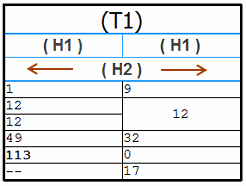
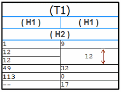
The formatting options explained below may be used to create the header row structure (H1, H2), rotated heading text, and data cell format shown in the following table.
To create and format table titles (T1, T2), see Using the Title tab.
![]()
You can change the structure of table columns, column headers, and data cells without changing the table style.
Use the Data tab in the Table Properties dialog box to apply formatting to data cells. You can:
Select an individual data cell and then specify font properties and data alignment.
First select the column header and then apply the formatting to change the appearance of all of the data cells in the column.
Double-click a header row cell to add and edit the column header. This opens the Format Column dialog box.
You can use the Format Column dialog box to define the column header text, apply formatting, and show or hide the heading. You can open the dialog box from the Data tab by selecting a data cell or the header cell and then:
Choosing the Format Column button  .
.
Selecting the Format Columns... shortcut command.
In a model-derived table, such as a parts list or bend table, you also can define column heading content and formatting on the Columns tab.
You can use the Format Table Cells dialog box to apply formatting to the currently selected cell in a header row, or to all data cells in a column. You can open the dialog box using either of the Format Cells buttons in the Format Column dialog box or on the Columns tab in the Table Properties dialog box:
Use the button in the Column Header section to modify headers.
Use the button in the Column Data section to modify data cells.
You can use the Undo command to undo a change to the table format.
Changing font, font style, and alignment
You can choose a different font from the Font list, apply boldface, italics, or underline, and change the vertical and horizontal justification of one or all data cells using the options at the top of the Data tab in the Properties dialog box.

You can change the text justification of the header cell in the column using the Format Table Cells dialog box.
Defining data cell content
In derived tables, such as parts lists, bend tables, and family of parts tables, you can add content to data cells using the lower portion of the Format Column dialog box.
Column headers are required for sorting and grouping table data. You can control column header structure using the following options.
Defining header content, justification, and formatting
You can define the column heading content—for example, (H1), (H2)—using the text box in the Format Column dialog box, or on the Columns tab.
For the currently selected header row, you can change the horizontal or vertical text justification and rotate the text. Use the Format Cells button to open the Format Table Cells dialog box.
You can change the text formatting of the column headers, for example, to apply boldface, italics, or underline, by creating an independent column header style.
Specifying number of header rows
A column header may consist of up to five rows. Use the Number of rows list, in the Format Column dialog box and on the Columns tab, to specify the total number of heading rows that all table columns have initially. The default number of heading rows is one.
Note:
The number of header rows you apply to the selected column is applied to all columns in the table.
Selecting header row number
Use the Text row list to identify the row to apply the changes to. This includes the content you enter in the Text box, the cell alignment adjustments you make in the Format Table Cells dialog box, and whether to merge the current header cell with the next.
Merging headers across multiple columns
You can create a column header that spans multiple columns or rows. Use the current column selection and the following options to control which column headers are merged and how they are merged.
Example:
You can select the following options to make the second row header (H2) span both columns.
Text row 2
Merge with next horizontal cell

Example:
You can combine the two heading rows in the right-hand column (H1) into one heading row, and rotate the text vertically using the following options:
Merge with next vertical cell (Format Columns dialog box )
Orientation=Rotated (Format Table Cells dialog box)

Example:
You use the following option to merge two data cells vertically, if they contain the same value:
Merge vertical cells with same value

Columns are merged from left to right, in the order that they are displayed in the table; rows are merged from top to bottom. The formatting of the first column with the Merge with next option selected controls the display of the merged columns.
If a column header is shown in both the header position and the footer position, then the same changes are applied to both the header and the footer.
Example:
You can create a two-row header, with the first heading named Mass, and have it span both columns. The second header row can be set not to span the columns, so that you can name the column one, row two heading Part Mass, and the column two, row two heading Total Mass.
Header text orientation (rotated and vertical)
When working with single-row headers, you can use the Orientation options in the Format Table Cells dialog box to specify header text that is horizontal, vertical, or rotated 90 degrees counterclockwise, so that the text is read from bottom to top.
Example:
You may want to use vertical or rotated header text orientation over a narrow column, such as an Item Number or ID column.
![]()
To prevent the text in a vertically oriented header cell from being truncated, do not select the Fixed header row height check box.
Making text fit
You can use the Adjust text to column width check box in the Format Table Cells dialog box to prevent text from wrapping within a cell. This option automatically fits the text to the cell by adjusting the aspect ratio of the text. This makes text narrower so that it fits the column width. Text is never lengthened to fit the column.
Example:
You may want to select this check box—Adjust text to column width— when using property text in the cell of a drawing border title block. This ensures the resolved property text string fits within the column width.
Header row divider properties
You can change the appearance of the horizontal and vertical lines between and below header cells by changing the line style. For example, you can use blue lines to distinguish the rows that contain headers and footers from rows that contain data.

The following options on the Lines tab in the Table Style dialog box control the header divider lines:
Header Separator—Specifies the appearance of the vertical lines between column headers.
Header-Data Separator—Specifies the appearance of the horizontal lines below column headers.
Creating an independent column header style
By default, the same Normal style is assigned to both table column headers and column data within the table style. To differentiate between the two, you can create or modify the following Table style selections on the Text tab (Table Style dialog box):
Title style—The default is Normal. You can create a new style and name it Table Title.
Column header style—The default is Normal. You can create a new style and name it Column Header.
Column data style—The default is Normal.
Note:
To learn about table styles and how to change the properties associated with them, see the following Help topics:
Table styles This topic provides an overview of the process.